Sylvester's takes from " Claws for Alarm"
Hello gang,
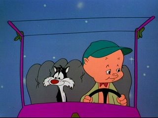
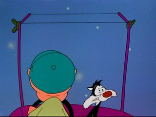
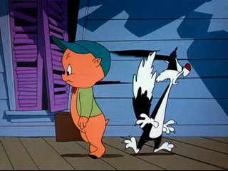
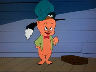
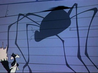
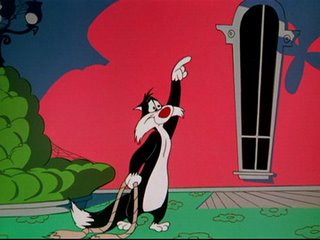
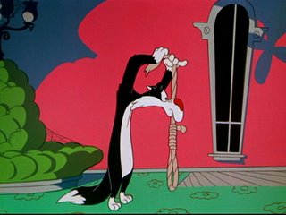
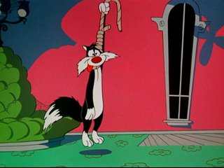
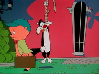
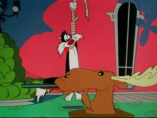
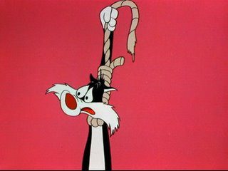
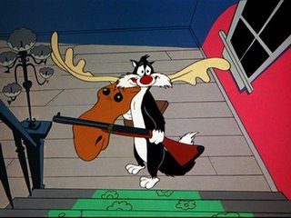
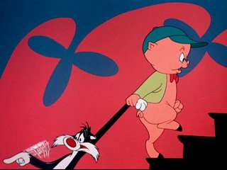
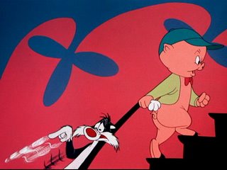
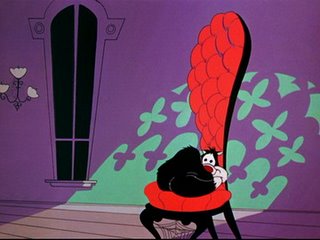
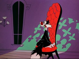
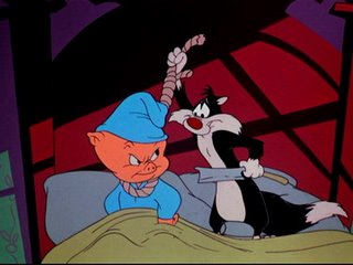
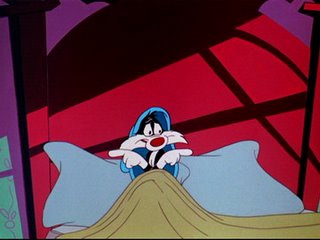
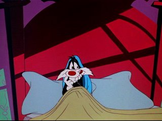
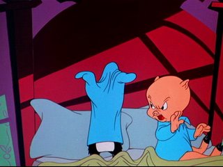
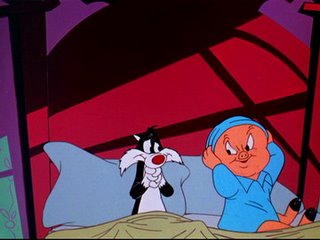
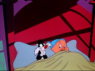
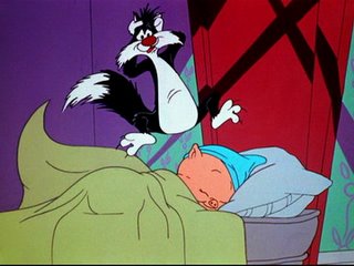
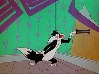
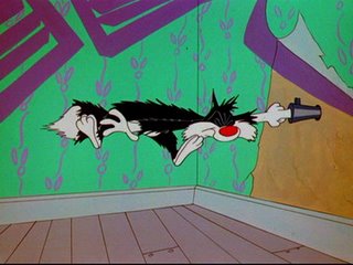
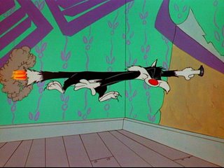
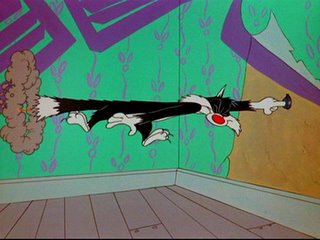
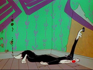
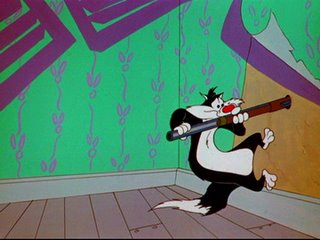
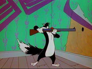
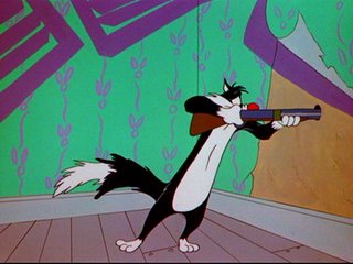
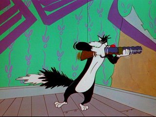
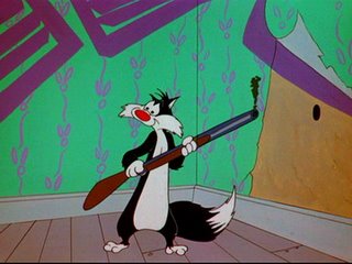
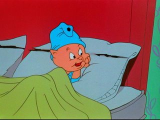
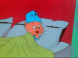
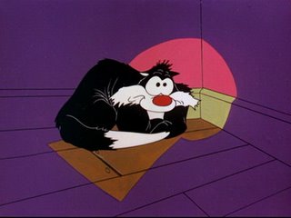
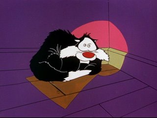
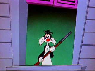
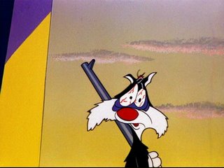
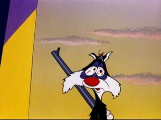
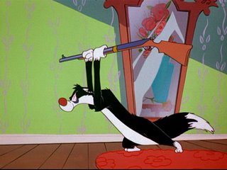
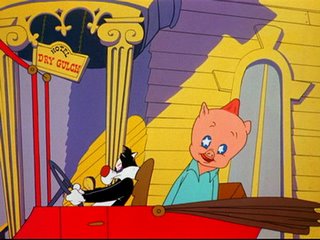
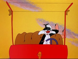
here you have, for your pure enjoyement, some takes from "Scaredy Cat"'s remake, "Claws for Alarm".
Look at how Chuck Jones' style changed in a few years.
Gone are the realistic backgrounds in favor of UPA-like backgrounds.
Gone is Sylvester's classic Freleng's unit-like design, instead we have a new feline character, looking as something between Claude Cat and Pepe Le Pew.
Great care is now given to the facial expressions, look at the attention to these details..amazing!
But..stop the talk and watch the stuff for yourselves! Feel free to post a comment here and go every 5 minutes to John K's blog, it's always worth the visit!



Yours Truly,
Duck Dodgers
Blog Founder and Administrator

8 Comments:
Thanks DuckDodgers for these awesome stills! i'm a huge fan of Chuck Jones, (especially his Pepe le Pew)
Chuck's drawings in this cartoon are so much livelier than in Scaredy Cat. i don't know what John K is talking about in that respect. i understand that all the black and red in the backgrounds in Scaredy Cat gave it a more urgent feeling, and the scenes thusly may feel more intense, but this certainly isn't because of the animation.
Claws for Alarm's backgrounds are riddled with colour and while it's visually appealing, it may not suit the mood of the original story. i'm sure Chuck had a reason for going with something new, but i would think it was more likely that he could see his own flaws as an artist in the first cartoon and hoped to improve on them in the second.
the drawings in Scaredy Cat were much looser and to me that makes them bland, cause any animation graduate should be able to make those basic shapes. the animation conventions of doubling pieces and adding streaks of movement may be what inspires John K, and certainly we don't see too much referrence of that in Claws for Alarm. the few frames we see with animated effects were much tamer than the those in Scaredy Cat.
Chuck's wild takes in Scaredy Cat signify his early approaches to animation, learning the limits and possibilities of distorting characters, while the subtle gestures in Claws for Alarm are the result of years of experience at honing his craft.
2:04 pm
Thanks for capturing my favorite frame of the whole cartoon! (7th from the bottom)
8:34 pm
Didn't Mr. Clampett also create Beanie and Cecil?
5:48 pm
you are weird
7:56 pm
you are weird
7:57 pm
Good write up
www.velocitysoftwares.com
12:48 pm
fantastic!i wish i was called duck dodgers.i might have to call myself that sometimes
1:01 pm
Hi there,
I'm a HUGE fan of the older cartoons. I grew up on Casper the Friendly Ghost. Woody Woodpecker, Tom and Jerry, and my beloved Disney. I absolutely love Steam Boat Willy. Animation seemed to have depth back then, just my opinion. Great Blog, I'll be back often to see more.
3:03 am
Post a Comment
<< Home